Hey there and welcome back.
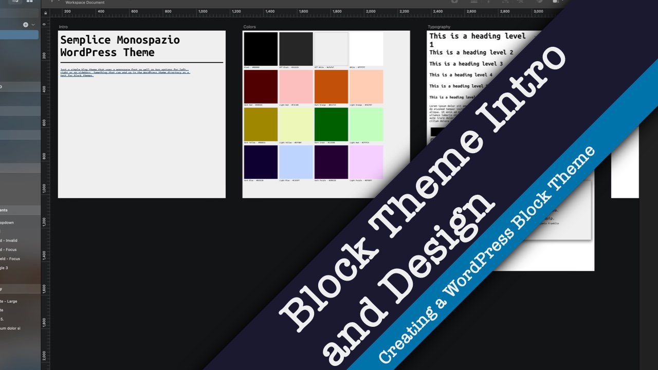
So today we’re going to continue on in our series on creating a WordPress block theme. Last time we took a look at the designs for Semplice Monosapzio, which is the block theme that I’ve created for WordPress just to see how to create block themes.
Today we’re going to continue on by looking at the theme dot json file as well as some styling that I had to do because not everything is covered through the theme dot json file.
If you don’t know what the theme dot json file is, basically it’s the file where you can control a lot of the styling that you would otherwise have to do in CSS. It’s a very powerful tool in a theme developer’s toolkit. But it does take a little bit to learn how to use it.
So today we’re going to walk through the theme dot json for the theme so you can learn how to use it for your theme.
Before we get started, if you want to see the rest of the videos in this series as well as videos on web development and other things, be sure to hit the subscribe button and to ring the bell for notifications.
Now let’s get started.
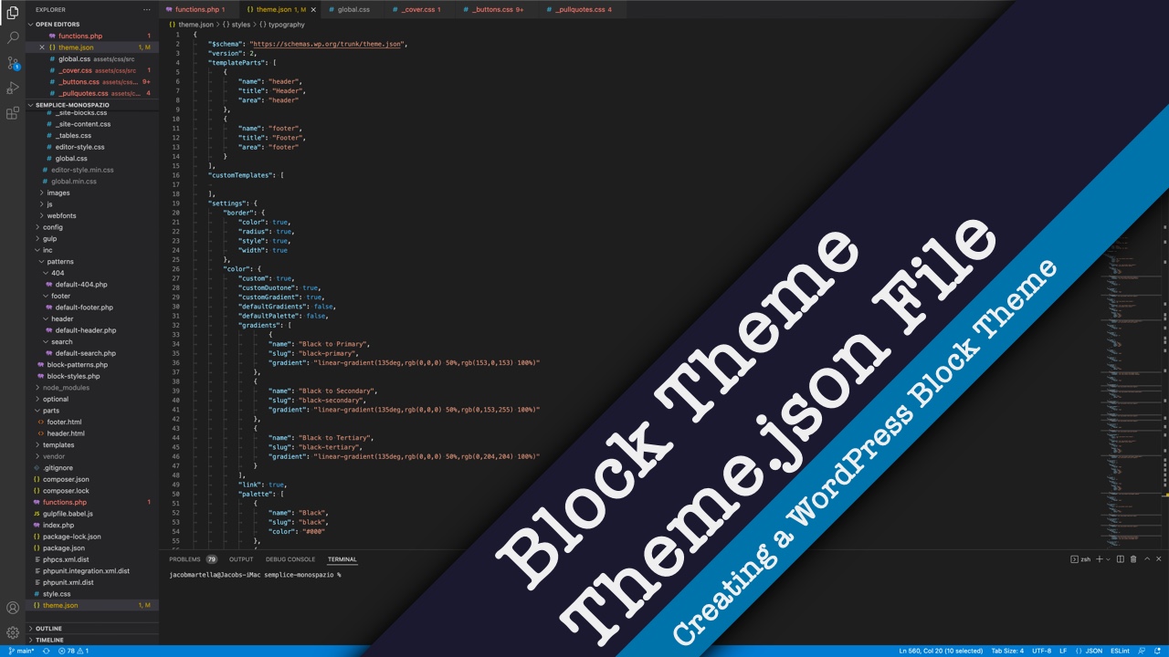
Okay so here we are in the theme dot json file for the theme. Now before we begin I do want to note that the GitHub repository for this theme is linked to in the description below. I also have the link to the WordPress dot org page where you can download the theme. And also I have created a starter FSE theme in GitHub that you can download and use that code to help you get started. And in fact a lot of the code that you see here is stuff that is in that file as well.
So anyway let’s go through the theme dot json file.
First off you want to be using version 2. This is the latest version as of this recording. And it has all of the great features that we want to see.
Now we’re going through all of these settings. Obviously we want the appearance tools to load. And for this theme I’m totally okay with having custom colors, custom duotone and custom gradients, but we are removing the default gradients and default color palettes.
And then beneath that we are defining our own color palette. It’s a good idea to have something that’s primary, secondary and tertiary or background, foreground or something like that because it will make changing out the colors for different theme styles much easier as you’ll see later on in this series.
But for now I’m just keeping the black and off black, off white and the white down here, dark and light versions of each of the colors that we talked about last time go here. And I do want to make note of the slug because that’s really what you’re going to be using throughout the rest of the theme and with everything else that you do. And you don’t really need to worry about the hexadecimal code.
So then we get down to gradients. I don’t really use gradients much in this theme. I could probably stand in later versions of this theme to update the gradients so that they’re correct. But for this early version I’m not too worried about that. But we can define the gradients. In here you would sort of define what color goes where and the things that you would put in the CSS we’re now putting in this theme dot json file, which is a little bit easier to read.
And then the same sort of with the duotone. We could add that here. I don’t really use much in the duotone in this theme right now, but again in future versions I might want to update that.
Next we’re going to define the spacing units we’re going to be using for this theme. I’m just going to keep it simple with pixels, em, rem, height of the viewer and the width of the viewer. And then sort of standardizing the layout with content size, which is sort of the normal, and then the wide size which is the align wide. You’ll see these come into play more once we get into the creating block patterns.
Next we’re defining our typography. We’re allowing there to be custom font size that the user can select specifically. We’re not doing drop cap, just because I mean it doesn’t really work with what we’re doing with the theme. But you certainly can if that’s the design you come up with.
And then here we have the font families. I’m only using one font family, Ubuntu Mono, which I mentioned last time. But something that’s now in the theme dot json file with WordPress 6.0 is the ability to add in these fonts locally. What I’m doing is loading it (Ubuntu Mono) into this folder, webfonts, and then calling it here. Simple as that. Very easy. Font weight if this file was a variable font weight file I could define it, because we’re only using 400 and 700 font weight, I would do this. If we had an extra bold we would add 900, something like that. But in this case this is just a regular font and then we have a specific bold one down here.
And you would load these in individually like this.
Next we have our font sizes. I’m doing 16 pixels for small, quote unquote, and then regular is our 18 pixels. All the way up to where what will be an H1 as you’ll see later is 50 pixels.
And then we have our custom variable other things to do with typography, spacing, the font weight, we’re only using normal and bold, and then line height.
And now we get into the really fun part where we’re really starting to style different elements as well as different core blocks. So here we’re defining some of the spacing. We have a 10 pixel gap between blocks. Here we’re setting the text color is going to be primary which is the black or off black color. And the background is the off white color or the secondary color.
And then we’re defining sort of the base typography — the font family, font size, font weight and all of that. And then you’ll notice that once we have it defined here in the theme dot json file, we’re using a CSS variable product. And this is where things get a little bit tricky and you need to pay attention because it’s not, it’s obvious it’s not the same for every attribute. So like color has the wp-preset-color. Font family is very similar with wp-preset and then font family. But then for some reason, font weight and line height are wp-custom. It’s just something that you have to check in and you might have to go to the inspector because all of these get output into the inspector. Scroll all the way down to the bottom of the CSS styling, and you should see them.
And then here we’re defining some of the styling for elements. So like for the link it’s the same color but it is underlined. For all of these headings we’re setting the font size.
And then next we get into the core blocks and we can add in predefined styling for these core blocks. The biggest example here is the buttons. We have the background color which is going to be the off black, and then the text is the off white or secondary color. And then we have the typography, basically the font size, font weight, we could put the font family if it’s different from the body font family. I did this with my personal website theme because I was using two different fonts, one for headings and one for body copy and I was using the heading font for the button fonts.
And then we can define what the border looks like, if it has a radius and how wide it is and all of that fun business. And then you have spacing, and you have almost all of these are available for all of the core blocks. And you can define all of them or you can define none of them. It’s really up to you. The button is going to be a big one.
A lot of these are pretty simple. There’s really not a whole lot that you have to do. There’s the cover block here. The group block. Obviously a lot of these are really small changes just to make sure things look how we want them to. And you can make them as complex or as simple.
The pullquote here. Now I will go ahead and say as I mentioned up here, there’s no thing here like for the different states, like the hover state or focus state. Unfortunately we still have to use CSS styling for to make that happen. And it gets a little bit tricky with the button block, especially if you have a ton of colors, like we do for this theme. Hopefully that gets fixed in future iterations on Gutenberg and WordPress. But for now we still need to use CSS.
And we’re also going to see that coming up with the pullquote and blockquote blocks.
That’s our navigation, just putting in the styling.
Really, I would go through the theme dot json file for this theme which you can find again in the link in the description below. And also a theme I used a lot for setting up this theme dot json file is the Frost WP theme by Brian Gardner. It was very helpful. It was very thorough. And it continues to be updated. And it’s a really good guide for the theme dot json file.
You also might want to check out the TwentyTwenty Two theme theme dot json file for reference as well. But really I would take some time to play around with it, you know change a few things, hit save, reload the theme, reload the site editor and see what’s changed and all of that fun business. Because it’s really, really cool.
You can also define template parts, give them names, slugs and all of that. And then even custom page and post templates. And we can define whether it’s going to be a page or it’s only going to be available for a page or just a post or another custom post type.
So that’s really the theme dot json file in a nutshell. Again just play around with it and see what you can do with it.
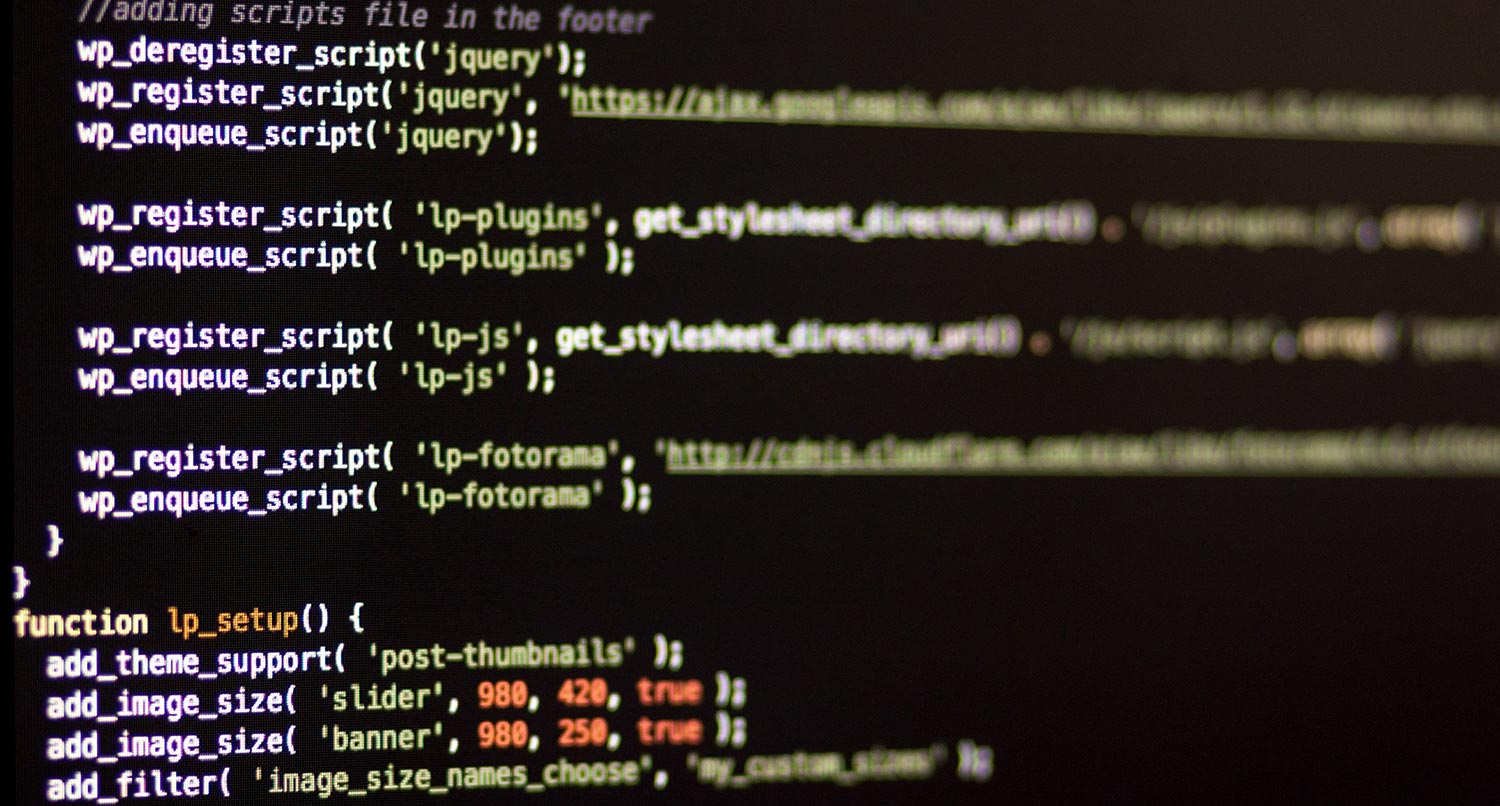
And quickly I’m just going to go through the button CSS. All of this CSS is PostCSS and it’s getting compiled when I run a Gulp function. And a lot of this I got from the WP Rig theme. So the FSE Starter theme that I have linked to in the description below, has a lot of functions where you can sort of run the styles, compile stylesheets, minimize the JavaScript, and then even bundle the theme. That’s all available for you to use through Node actions and Gulp actions and whatever.
But I’m going to end today with the buttons dot css file. Just looking through it you will need to target these at least for the moment when you’re doing all of this. You probably don’t need all of this anymore just because this is a lot of carry over from other legacy PHP themes that I have built. But I still have it, and I might remove it in later versions of the theme.
What we’re really focused on is these hover states. That will give us, help us do something when someone hovers over it or focuses on it through their keyboard or whatever technology they’re using to browse the website. As you will see once we start to build out this theme in the site editor, if you when you give a button a background color it gives it this has-background CSS attribute or CSS class. So we want to target that. And it will also give you a new CSS class that has has- and then the slug for the color and then background color. So I’m targeting each of these really just to make sure the colors are correct.
You can tell that these are the color selectors earlier on in the theme dot json file, so it makes it easy to just sort of repeat over and over for each of the colors. I haven’t found a workaround that eliminates this part yet. Hopefully that is coming, we’ll just have to wait and see.
And then there’s another variation of the button block with the is-style-outline. And this is basically almost like the inverse of what we already have with the hover state on the normal one with the outline and then the sort of white background or whatever. Here I’m also defining that just to cover my bases for now. Hopefully again this gets fixed later on.
But I would highly recommend that you look around. Again this is all in the GitHub repository. You know, see what it is. You can download it yourself and fork it and make changes or do whatever. But really familiarize yourself with this theme dot json file because there’s a lot in here. Even though I had to do a lot with the button styling, it’s still, all of this pales in comparison to the CSS I would have to write for a legacy PHP theme. This really cuts down on a lot of the CSS that I have to do when I’m creating a new theme.
So that’s it for today. I know that we covered a lot of ground with the theme dot json file, but do you have any questions about it or how to style block themes? Be sure to leave them all down in the comments section below and I will do my best to answer them.
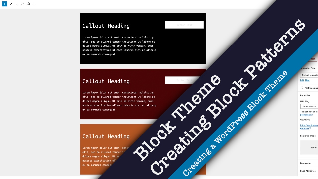
Next time we’re really going to dive into the fun parts of creating block patterns for our theme. To see that video and other videos in this series as well as other videos on web development, be sure to hit the subscribe button and to ring the bell for notifications.
But that is it for today, thank you for watching and I will see you next time.